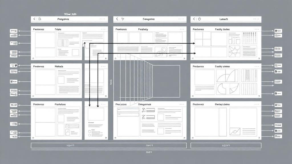
From Wireframes to Wow: The Psychology of Visual Hierarchy
Good visual hierarchy is invisible. Users don't notice it - they just effortlessly flow through your interface. Here's how to master the psychology behind intuitive designs.
Good visual hierarchy is invisible. Users don't notice it - they just effortlessly flow through your interface. Bad visual hierarchy screams from every pixel. Here's how to master the psychology behind what makes designs feel intuitive.
The Neuroscience of First Impressions
Users form opinions about your interface in 50 milliseconds. That's faster than conscious thought. Visual hierarchy isn't just about aesthetics - it's about leveraging how human brains process information.
The F-Pattern Reality
Eye-tracking studies consistently show users scan in an F-pattern:
- Horizontal movement across the top
- Second horizontal movement partway down
- Vertical movement down the left side
Design with this pattern, not against it. Place your most important elements where eyes naturally go.
Size Isn't Everything (But It Helps)
The Hierarchy Toolkit:
1. Size and Scale
Bigger draws attention, but use it sparingly. If everything is big, nothing is big.
2. Color and Contrast
High contrast elements pop forward. Use color strategically to guide attention, not decorate.
3. Whitespace as a Tool
Whitespace isn't empty space - it's breathing room that makes important elements stand out.
4. Typography Hierarchy
Establish clear relationships: H1 for primary headlines, H2 for sections, body text for details. Consistency creates predictability.
The Squint Test
Squint at your design. What stands out? What disappears? The elements that remain visible when squinting are your primary hierarchy. If the wrong things stand out, adjust.
Common Hierarchy Mistakes
1. The Everything-is-Important Trap
When everything competes for attention, nothing gets it. Prioritize ruthlessly.
2. Inconsistent Patterns
If your primary buttons are blue on one page and green on another, users have to relearn your interface.
3. Ignoring Content Hierarchy
Your visual hierarchy should match your content hierarchy. The most important information should be the most visually prominent.
The Mobile-First Hierarchy
Small screens force prioritization. Design for mobile first, then expand. If your hierarchy works on mobile, it'll work everywhere.
cost-effective user research methods Your Hierarchy
The 5-Second Test:
Show your design for 5 seconds. What do users remember? What they recall should align with what you want them to focus on.
The Task Success Test:
Can users complete key tasks without hunting for interface elements? If they're struggling to find the "Buy Now" button, your hierarchy needs work.
Psychology in Practice
Great visual hierarchy feels effortless because it works with human psychology, not against it. When users can scan your interface and immediately understand what's important, what's secondary, and what actions they can take, you've created something more valuable than pretty pixels - you've created clarity.
And in a world of infinite digital noise, clarity is the ultimate competitive advantage.
Related UX Design Articles
Finding a UX Job in 2025 – What Works (and What Doesn't)
Lessons from breaking into UX in a crowded market — mistakes, pivots, and strategies that actually work today.
Case Studies That Win Clients – Beyond Pretty Screens
Why design case studies should focus on problems, impact, and thought process — not wireframe montages.
How AI Is Changing UX Design – A Designer's Perspective
Practical insights on where AI helps and where it confuses users — and how to design with trust in mind.