
Designing for Trust When the Product Is the Risk
Most software fails softly. Some of it fails into someone's health, money, or safety. When being wrong has consequences, trust stops being a layer and becomes the product.
Most software fails softly. A confusing checkout costs somebody four minutes and some patience. A cluttered dashboard produces a slightly worse decision on a Tuesday. Real costs, all recoverable.
Some products are not like that. If a booking platform for herbalists puts someone in front of a practitioner who is not what they claim to be, that is a health outcome. If an app that arranges pickup games between strangers is casual about who shows up, that is somebody's physical safety. If a financial tool makes a position look certain when it isn't, that is somebody's money.
In those products, trust is not a layer you apply at the end. It is the thing you are actually shipping. Everything else is delivery.
A Credential Is a Gate, Not a Badge
 Verification that actually blocks something, rather than a badge that decorates a listing. Photo by Zaqy Al Fattah on Unsplash
HerbaLink connects people with herbalists. The obvious design is a checkmark next to a name and an upload form somewhere in settings. I built the other version, where credentials are the gate.
A badge decorates. It tells you somebody was checked once, by someone, at some point. A gate decides. Unverified practitioners do not appear in results, cannot accept bookings, and lose that ability the moment a credential lapses. None of that is visible in a screenshot. It lives in the state machine underneath (submitted, under review, approved, rejected, expired, resubmitted) and in the answer to the question nobody asks in a design review, which is what happens to a booking that already exists when the credential behind it goes stale.
The harder decision was the catalog. It is smaller than it could be, deliberately. A bigger directory converts better in the first week and destroys the entire premise by the second month, because the promise was not selection. The promise was that anyone you find here has been checked. Honest and smaller beats comprehensive and padded whenever safety is the value proposition.
Safety Built Late Is Decoration
CatchBuddy matches people for same-day pickup sports, which means the core interaction is a stranger meeting a stranger somewhere physical within a few hours. The safety work came before the matching work, and the ordering mattered more than any individual feature.
Build matching first and safety becomes a settings screen. It ends up as a toggle nobody finds, a report button three taps deep, and a set of guidelines in a modal that gets dismissed. Build it first and it constrains what matching is even allowed to do: who can see whom, where a first meetup is permitted to happen, what has to be true about an account before it can appear to anyone else.
Same amount of code either way. Completely different product.
Trust Is Mostly What You Refuse to Hide
On Stips, my play-money prediction market, the number on a card is a probability wearing a dollar sign. Sixty-seven cents means the crowd thinks it is sixty-seven percent likely. The temptation in that kind of interface is to make the number feel authoritative when it isn't, because confident numbers look better. The design goes the other way: show what the payout would be before anyone commits, and let the price read as an estimate that can be wrong rather than a verdict.
Stips also generates its markets from the news with a model, which is a trust liability sitting inside the product. One of the first bugs I hit was generated markets closing on dates already in the past, because a language model has no clock. A user who sees an expired market on a fresh board does not think the date logic is off. They think the whole thing is fake. Nothing about that failure is technically severe and it costs you the entire relationship.
The Enterprise Version of the Same Problem
This is not only a consumer concern. The investor loan platform I worked on had to become the system of record for multi-million-dollar deals, replacing spreadsheets that people trusted because they had built them. Three earlier attempts had failed.
What moved it was the audit trail sitting next to the record instead of in a separate log nobody opened. Compliance could see who changed what without asking anyone, so compliance stopped being the obstacle and started advocating for the tool. Visibility bought adoption. No amount of interface polish had.
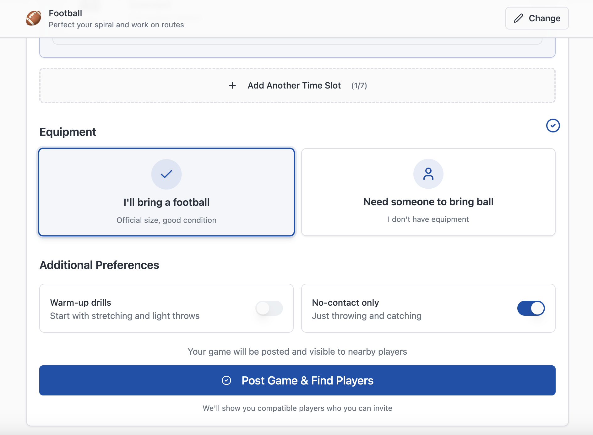 The small disclosures two strangers trade before meeting. Trust gets built out of specifics.
What This Costs You
All of it is slower and none of it demos well. A verification gate means fewer listings at launch. Showing uncertainty means your numbers look less impressive than a competitor willing to round up. Designing safety first means the first release does less.
I take that trade because trust is not a score you accumulate. It is a balance you can only spend down. Every product in this category dies the same way, which is one incident that confirms what a cautious person already suspected. You are not building toward a moment when users decide to trust you. You are avoiding the moment they decide not to.
Related UX Design Articles
Verification Is a Door, Not a Sticker
Most directories let anyone list, then put a badge on whoever checked out. Flipping that, nobody is visible until they're verified, gives you a smaller catalogue and a far more honest one.
The Work Is Deleting, Not Generating
AI made producing screens almost free. That moved the bottleneck from making things to deciding which ones to throw away, and no model will do that part for you.
When Trust Is the Product, It Can't Be a Feature
Getting two strangers to agree to meet at a park is easy. Getting them to feel fine about it's the entire product, and it's not something you bolt on near the end.