When Trust Is the Product, It Can't Be a Feature
Getting two strangers to agree to meet at a park is easy. Getting them to feel fine about it's the entire product, and it's not something you bolt on near the end.
Most products treat safety as a section. There's a settings page, a reporting flow, a policy document nobody reads, and everyone agrees it's important in the way people agree flossing is important.
That works right up until trust is the thing you're selling. Then it stops being a section and becomes the shape of every screen.
The Real Problem Was Never Scheduling
I built an app for pickup sports. The obvious framing is logistics: who is playing, where, at what time. Calendars, notifications, a map.
That framing is wrong. Scheduling is genuinely easy, and the existing apps do it fine. The reason nobody uses them is that they assume you want a season, with a commitment and a recurring team and a roster. Most people want a game on Saturday.
Strip that away and what is left is the actual problem: two strangers agreeing to meet at a park, and both of them feeling fine about it. Everything else is a detail of that.
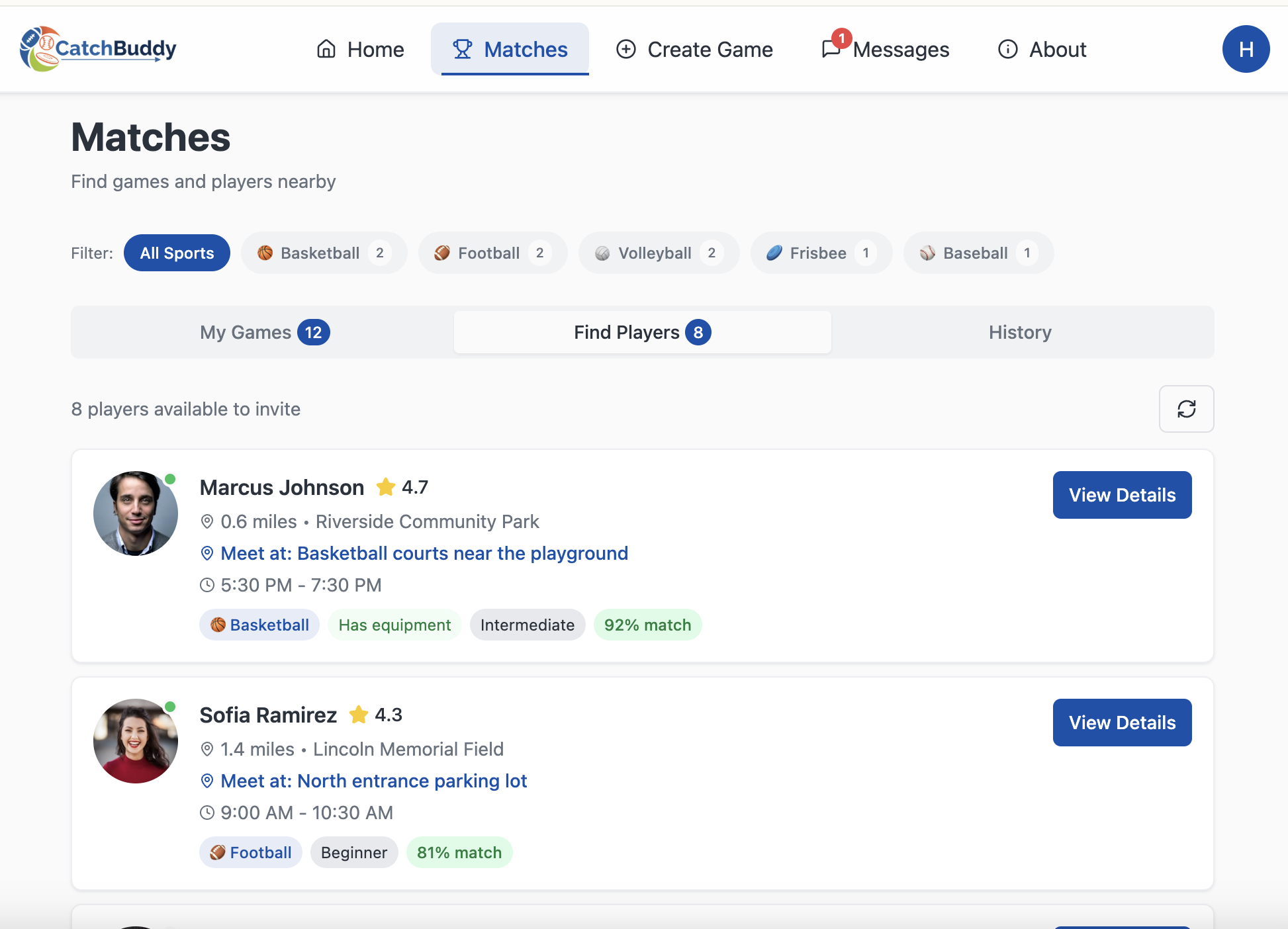 Match scores on the player cards. The label used to say Matches, and testers read it as a dating app every single time.
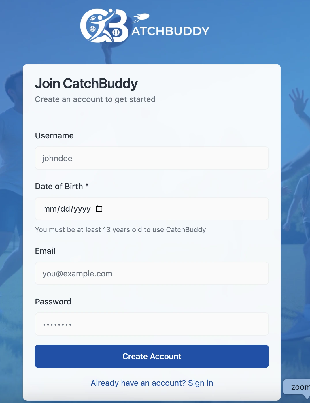 The 13+ gate at sign-up. Safety that arrives in v1 shapes the product. Safety bolted on later is a settings screen nobody opens.
What That Changes
Once you accept that, design decisions stop being about efficiency and start being about reassurance. Who is this person. Have they shown up before. Is this a public place. What happens if it goes badly.
None of those questions are answered by a faster flow. Some of them are answered by a slower one, a step that exists purely so the person on the other side has something to go on.
That is the part that gets cut in a normal design review, because it looks like friction and friction is the enemy. It's only the enemy when the thing you're optimising for is speed. Here the thing being optimised is somebody's willingness to get in the car.
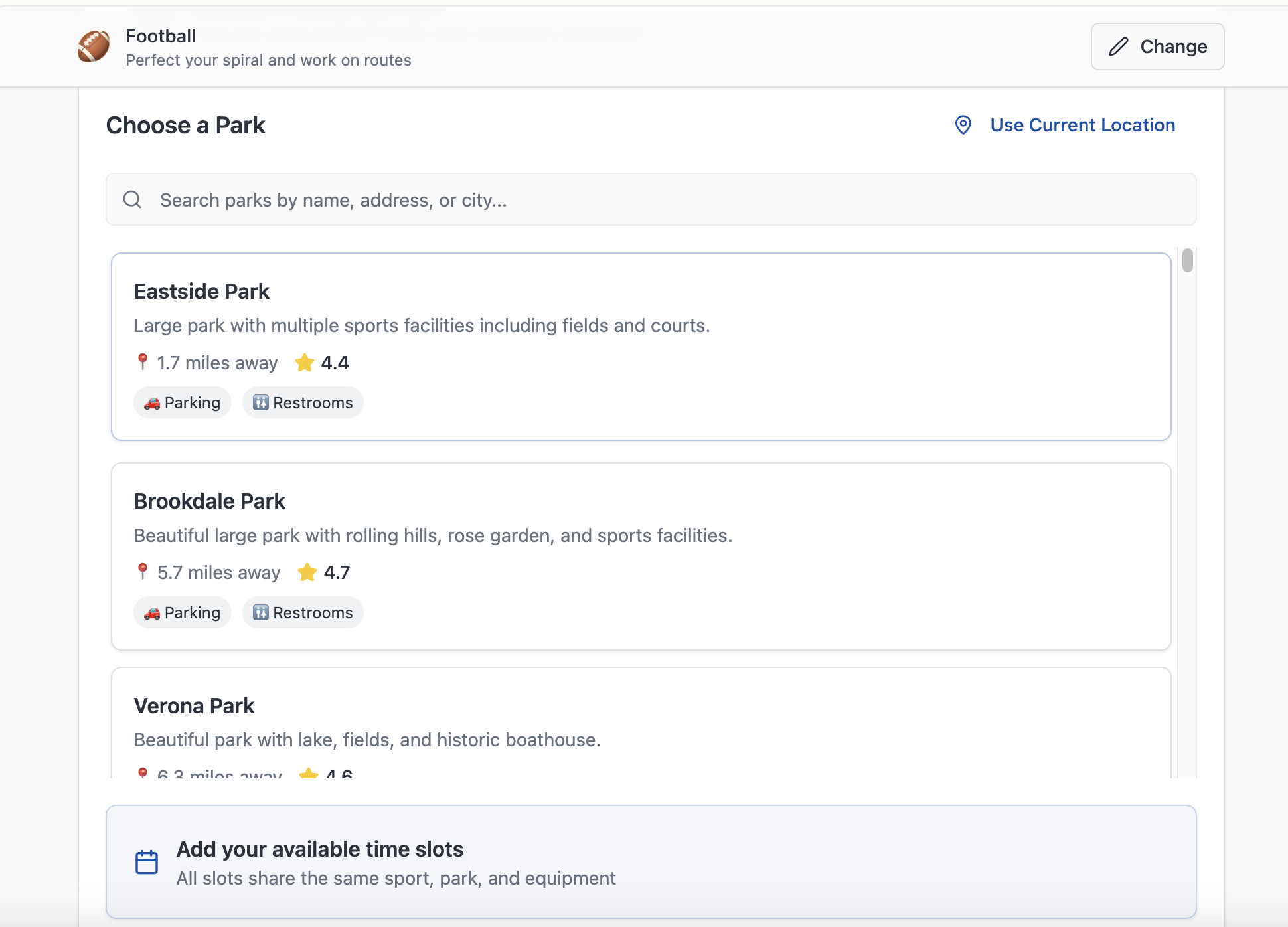 A curated list of parks with distance and amenities. You can't drop your own pin, and the restriction is the feature.
The Test
The question I kept coming back to wasn't "is this easy" but "would I send my kid to this". That's a harder bar and it rules out designs that test well on every conventional metric.
If trust is the product, the honest version of your roadmap has safety at the top and the clever features underneath. Most roadmaps have it the other way round.
The specifics, the age gate and what I cut and what testers skipped every time, are in the CatchBuddy case study.
Related UX Design Articles
The Work Is Deleting, Not Generating
AI made producing screens almost free. That moved the bottleneck from making things to deciding which ones to throw away, and no model will do that part for you.
If You Make People Do Maths, They Guess or They Leave
A price of 67¢ tells you the odds are 67%. Almost nobody works that out in their head, and the ones who try get it wrong. Do the arithmetic for them.
Verification Is a Door, Not a Sticker
Most directories let anyone list, then put a badge on whoever checked out. Flipping that, nobody is visible until they're verified, gives you a smaller catalogue and a far more honest one.