If You Make People Do Maths, They Guess or They Leave
A price of 67¢ tells you the odds are 67%. Almost nobody works that out in their head, and the ones who try get it wrong. Do the arithmetic for them.
A prediction market answers one question: how likely is this? The price is the answer. A share at 67¢ pays out $1 if the event happens, so the market is telling you it thinks there's a 67% chance.
That is elegant, and it's why the whole mechanism exists. It's also arithmetic, and arithmetic is where products lose people.
Every Interface I Opened Looked Like a Terminal
Order books. Spreads. Share counts. Position sizing. The underlying question is simple, how likely is this, and the screen in front of you is anything but. People leave before placing anything, and the ones who stay are the ones who already knew.
Everyone calls that a learning curve and bolts on a tutorial. It's not a learning curve. It's the product asking you to do a calculation it could have done itself.
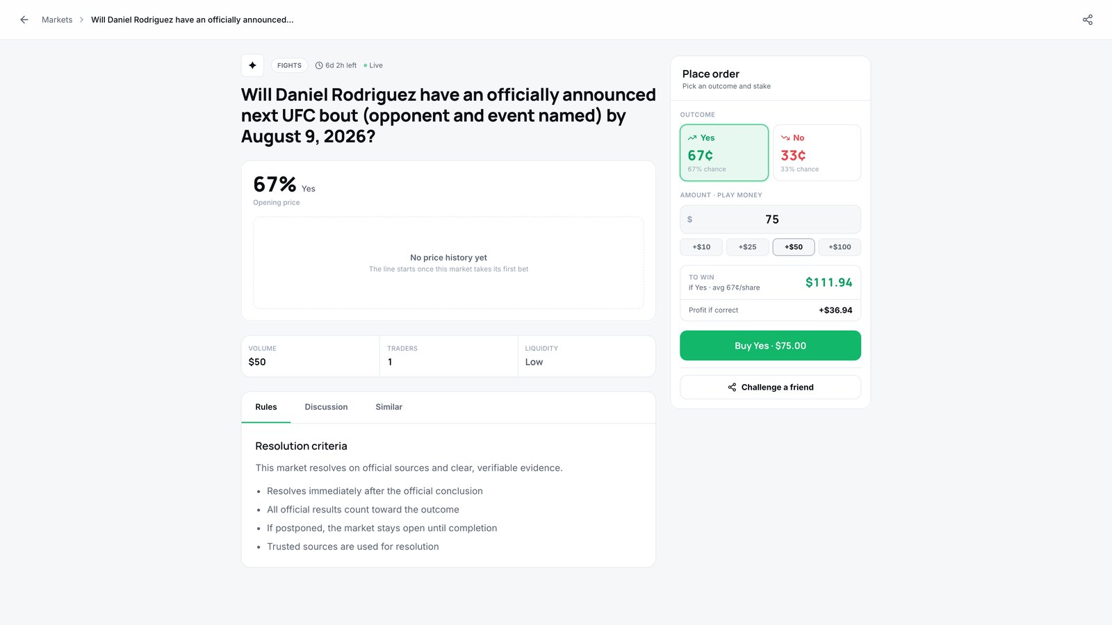 $75 on Yes, and the panel has already worked out $111.94 back with $36.94 of profit. Nobody should do that arithmetic in their head.
Show the Answer, Not the Inputs
So the order ticket does the work. Pick Yes, put $75 on it, and the panel tells you what happens: $111.94 back if you're right, $36.94 of that's profit. Not a share count. Not a spread. The two numbers you actually wanted.
Nobody should have to work out what 67¢ a share means for their stake. If you make them, they guess, or they leave. Both are your fault.
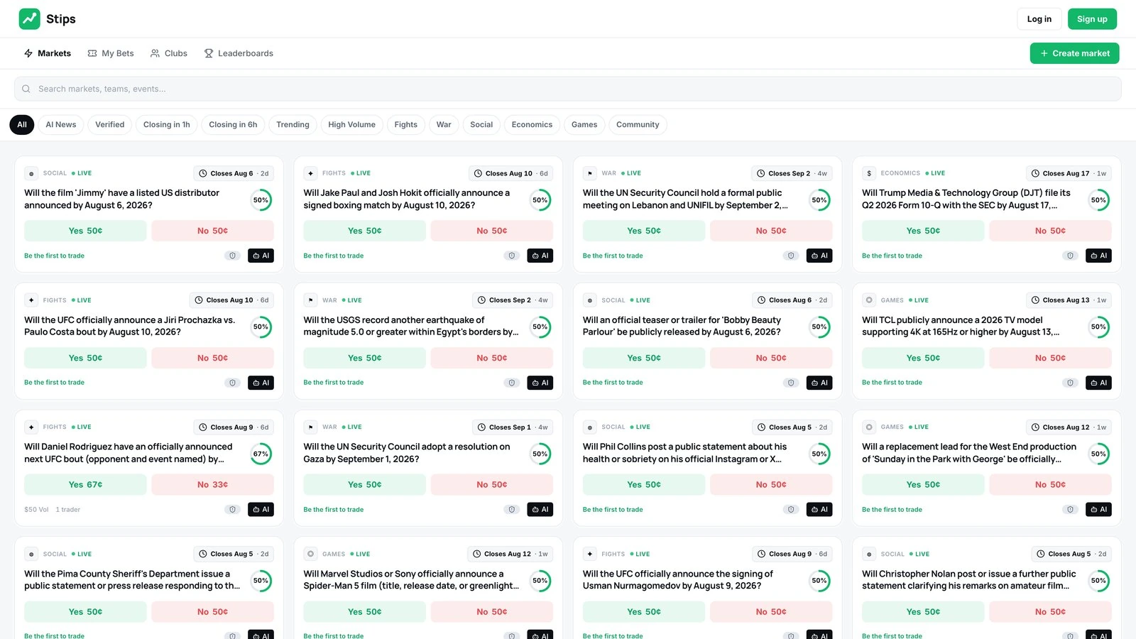
Price, close date and volume on every card, so the odds read at a glance instead of after a calculation.
This Generalises Further Than Finance
Anywhere your interface shows a rate, a ratio, a per-unit price or a percentage, ask what the person is actually going to do with it. Usually they're going to multiply it by something to get a number they care about. You already know both values. Show them the result.
The unit price is for comparing. The total is for deciding. Most screens show the first and make you derive the second.
How the board, the market page and the ticket fit together, plus two things I got wrong, is in the Stips what a portfolio proves now .
Related UX Design Articles
The Work Is Deleting, Not Generating
AI made producing screens almost free. That moved the bottleneck from making things to deciding which ones to throw away, and no model will do that part for you.
When Trust Is the Product, It Can't Be a Feature
Getting two strangers to agree to meet at a park is easy. Getting them to feel fine about it's the entire product, and it's not something you bolt on near the end.
You Don't Replace Excel by Being Better Than Excel
A bank was running multi-million-dollar loan deals in spreadsheets. The software that replaces that has to lose to Excel on flexibility and win on the thing Excel can't do at all.